As a gallerist, I constantly receive promotional materials from artists: show cards, business cards, gallery submission packages, and so forth. Some are wonderful and some are uninspired. A photographer with a poorly designed promotional piece will not get the same attention as a photographer with an elegant, consistent brand that reflects who they are as an artist. And just as photographers are their own worst editors, many of them should also consider seeking outside design assistance for their promotional materials.
Kate Ziegler and Jack Romano are the owners of Union Jack Creative, a Boston-based design company that specializes in customized promotional materials and websites. They are also the brilliant people behind the print design for Don't Take Pictures. We asked them to share their thoughts on design and the many ways that visual artists can benefit from collaborating with professional designers rather than going it alone.
1. What is the focus of Union Jack Creative?
Union Jack Creative is focused on creating custom designs based on clients’ vision, audience and budget. We work from scratch to figure out what works best for each project, and we translate clients’ hints and ideas into a concrete, elegant final product.
2. Unlike other businesses in need of design, photographers must put their own aesthetics at the forefront. This means working with a designer whose visual style meshes well with theirs. How does UJC view working with those who are also visually inclined? How much collaboration is involved?
Working with visual artists can be both incredibly challenging and incredibly rewarding from the perspective of a designer. When aesthetics mesh effortlessly, it can be refreshing to work with a client as focused on quality and outcome as we are, but it can also be challenging to rein artists in. To design for web or print, we need to address production considerations, timeline and even durability; a piece intended as a mailing can’t be delicate, no matter the vision. It’s our role to take that vision and construct something concrete and appropriate for the media without losing the clients’ style in translation.
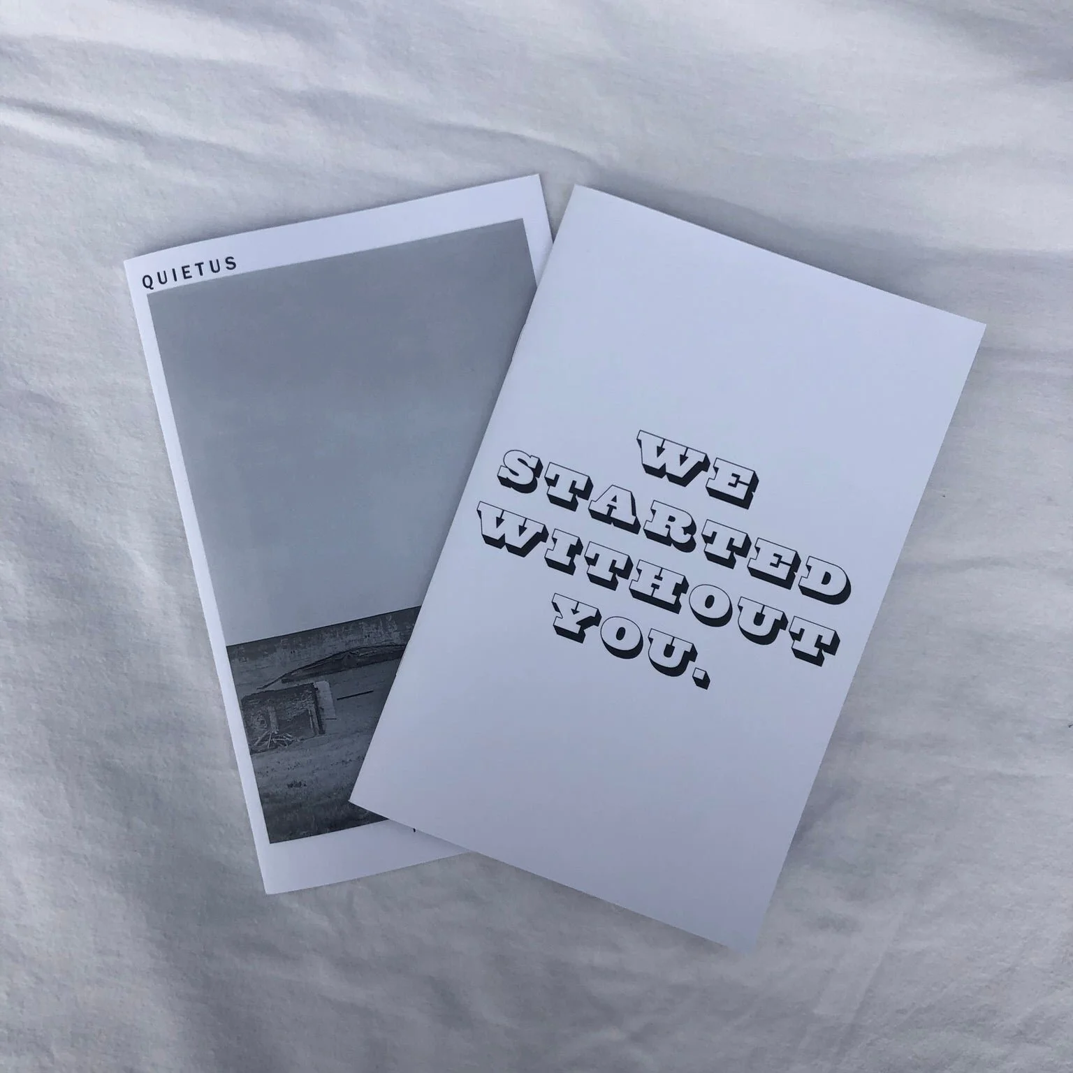
Event invitation, 2014
3. The promotional pieces that I see most often from photographers are websites, business cards, newsletters and promotional mailers. What is UJC’s approach to branding across these mediums?
Designing across web and print is absolutely doable, but requires attention to detail. Web design trends don’t always align with print trends, so pulling a design from the web directly to print materials won’t translate well; something will end up looking cluttered or dated.
Especially for visual artists, we tend to approach web design as very graphics-heavy, very focused on the portfolio, and with minimal bells and whistles to distract from the work. When that design moves toward print, we already have a style guide to work from - fonts, colors and logos will remain consistent - but we design each print piece to a specific purpose and audience. Our business card designs tend to be clean and with space on the verso to write; we suggest promotional mailers be glossy and on heavy stock for durability. We try to get a use-case in mind for each piece, so that we can put together a design that truly works for the client and their audience alike.
4. Most photographers own some kind of design software, but it takes a lot of study and practice to utilize their full potential. What tools does UJC incorporate into their design work?
In our work we utilize traditional craft techniques along with the standard digital tools: Illustrator, Photoshop and InDesign play alongside calligraphy, watercolor and basic pencil and paper in our studio. If we're stumped on a digital element, we'll sketch it out until we have a shape we're happy with, then scan it and create a vector file from the sketch.
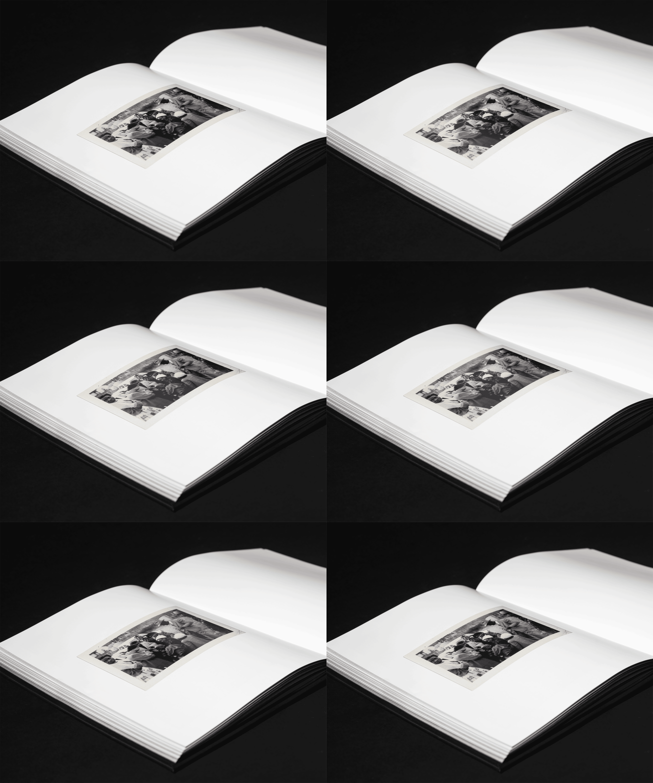
Event invitation, 2010
It does take practice, though - and truly, even for photographers adept in Photoshop and other design software, designing for web and print simply requires a different mindset. Photographers might certainly have the skills necessary to put together their own print pieces, but a designer starts from a different perspective and brings a different professional experience that streamlines the process and accounts for usability.
5. Probably the biggest reason that photographers and the general public decide to forge ahead without the consult and advice of a professional designer is to save money. Budget is always a factor with any professional service. How does UJC work with artists on a budget?
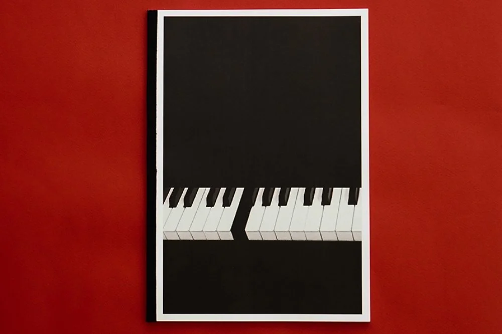
Hand-punched card, copperplate calligraphy.
Since we work almost entirely in custom design, we’re uniquely positioned to work with clients’ budgetary restrictions from the very beginning. If artists are up front with us about their constraints, we can advise on creative solutions that meet both aesthetic and budgetary requirements. Letterpress might not be feasible, but perhaps less expensive spot UV would help a logo pop; tri-fold designs with multiple pieces might be something that we could source but leave to a client to assemble to cut down on cost. There are almost always solutions, and a professional design team can help to source those, and save time and money by getting it right the first time.
Design doesn't just happen. Like photography, it is a skill that requires time and vision. I strongly advise photographers to view collaborate with designers to take the presentation of their work to the next level.
Kat Kiernan is the Editor-in-Chief of Don't Take Pictures and the Owner and Director of The Kiernan Gallery.
This article was first published in Issue 1 of Don't Take Pictures.


