“I never want to see another picture of ________.” Industry veterans share their pet peeves on themes in contemporary photography. In this series they present their “rule” along with five photographs that break the rule in an effort to show that great work is the exception to the rule.
Rule Setter: John Foster, Contributing Editor for Design Observer, photography collector, and independent curator
Rule Breaker: Rachel Phillips
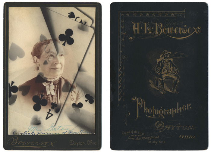
I never want to see another image of a newly painted or altered 19th century cabinet card. Early on in this genre (which is young, only in the last decade), I have to admit I was interested. The work, created by any number of contemporary artists, was bringing a fresh look to something old. The idea of altering an old image for a completely new point of view had merit. There is nothing wrong with that and I can see the interest collectors might have in it. And some practitioners of this are doing some beautiful work. But today, more and more lesser artists are trying their hand at altering cabinet cards, and much of it feels rather “craft” oriented to me. Now I see them showing up at craft shows and community art fairs—just more “cute and whimsical,” for the easy public.
Cabinet cards were all the rage in the late 19th century. People and families could buy ready-made albums for the cards, with precut windows—ready to insert all your family members, relatives and friends. Like any collecting genre, it must have been fun (and probably a bit addictive) to complete your album. Now, a hundred and twenty some years later, they are easy to find and inexpensive (you can find a basic cabinet card today for under $5).
Studio portrait photographers were popping up in every town in America, and they were not particularly creative in what they did. The sizes were fixed verticals (usually 6.50” x 4.25”), you sit, and a day later you had your photo card.
I dare say that the majority of cabinet cards are collected today largely for 1) historical reasons (portraits of past celebrities, etc.), the oddball pose or unique image (like a photo revealing a person’s occupation, or landscape, perhaps); or 2) for the backs of the cards, which sometimes showcase beautiful typographic advertising for the particular photo studio.
After reviewing a number of artists who are doing some good work with altered cabinet cards (Los Angeles painter Alex Gross and Toronto-based artist Sara Angelucci, are two standouts), I selected San Francisco artist Rachel Phillips as the exception to my rule.
Her idea of looking at the past through cabinet cards grew first by understanding something about the period of time in which the cards were made. Her research and her understanding of history showed that spiritualism was also popular in the late nineteenth century, so her series theme of Divination was perfect. According to Rachel, the series was largely about “re-incarnating the people in these photographs by considering them again; making the past once again present, and giving us a vicarious way to ponder the passage of our own lives.” In transforming her cards, Rachel uses a time-consuming photographic transfer technique, rather than paint or paper collage. This alone sets her apart from most.
That is why Rachel Phillips is my exception to the rule. She is not just giving the emperor new clothes, she is finding appropriate, thoughtful imagery for each cabinet card in her series.
—John Foster


