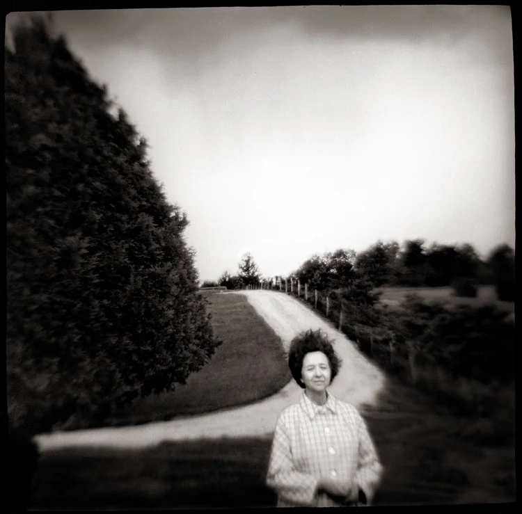
Whether you are a photographer or photography collector, it is important to display your photographs in a dynamic and engaging way. Arranging your photographs into groups can help achieve this, as it allows for intermixing images to create a wall display that is greater than the sum of its parts.
Photographers working in series should consider a cluster of images, as in Fig. 1. This four-portrait array by Ananda Lima creates a sort of meta-portrait, showing multiple aspects of the subject.
Fig. 1 – Portrait Array – Photo Courtesy Ananda Lima
Fig. 2 – Corner Cluster – Photo Courtesy Ananda Lima
Lima also demonstrates the power of subtle connections in an elegant cluster (Fig. 2), which makes a virtue out of a tight corner. Hung together, the photographs of doors, windows, corridors and fences comment on space and dimension, barriers and openings. The asymmetrical arrangement creates a strong vertical line in the right-hand column, with the square prints on the left adding visual punctuation. Even relatively small prints like these can, when grouped skillfully, create the feel of a large, unified piece.
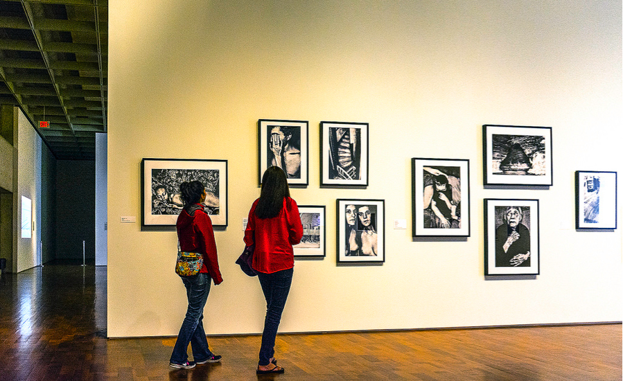
Fig. 3 – Portrait + Landscape Grouping – Photo by Steve Evans, used under Creative Commons
Lima often begins her installations by visualizing a grouping, and perhaps making a rough sketch, especially when multiple walls are involved. She considers “how the pieces look together in terms of color and composition, how they interact visually and conceptually, how the grouping will direct the gaze. I like having repeating patterns or lines or colors across the pieces. It’s great if the space itself can participate, by having lines going towards the images, or framing them as a group.”
The exhibit designer in Fig. 3 also implemented this approach. The traditional portraits are placed in the center, commanding immediate attention, while the flanking images, in contrasting horizontal format, are less conventional in their compositions.
Grids are often effective, but don’t feel bound to them—the sequence in Fig. 4 has a dynamic flow that draws the viewer into the gallery and along the line of images. While planning the installation, Lima leans the photographs against the wall where they might hang, or lays them on a table to see if they gel as a unified whole. “Finally, I place them on the wall, which is the most telling part of the process,” she says. “Each step usually results in rearranging, or even rejection of certain pieces.”
Fig. 4 – Freeform Grouping – Photo by David Meyer, used under Creative Commons
Precise hanging is essential, especially for grids. A crooked or out-of-line image will distract the viewer and undermine the effect. Lima, and many other artists and gallery owners, find that a wall-mounted art hanging system greatly simplifies the process, and facilitates in-place experimentation.
Enjoy the process of creating your groupings—it’s a great chance to view your work with a fresh perspective, and perhaps discover some themes that you might not have noticed.
Guest contributor Pete Dunn is director of marketing for Gallery System Art Displays, which supplies art hanging systems to thousands of galleries and other exhibition venues. It is his good fortune to be the son and husband of visual artists, which has provided him with hands-on display experience.


