The first goal of any art display is to offer a compelling invitation – to create a visual space that engages the viewer’s eye and mind. Photographers exhibiting at art fairs, open studios, and other venues can achieve this by using simple techniques to create sophisticated, eye-catching displays.
An important first step is matching the number of works on display to the available space. Packing every square inch of a small wall often results in the viewer not being able to discern any of the individual pieces, especially in high-traffic situations like festivals and fairs where dozens of displays compete for attention. Strategic use of open space will attract and guide the viewer’s eye, even from a distance, and enable them to focus in a comfortable way. Give your pieces room to breathe.
By the same token, if you have a larger space to work with, avoid stale displays of long, unbroken rows of work, especially if the pieces are the same size and framed or mounted in similar ways. This “all in a line” approach encourages people to see a collective group rather than the individual images (think about a row of soldiers or parked cars – we see the row and not its members). Instead, create modules that have their own identity: clusters of different-sized works, grids, and other groupings that add energy to the work.
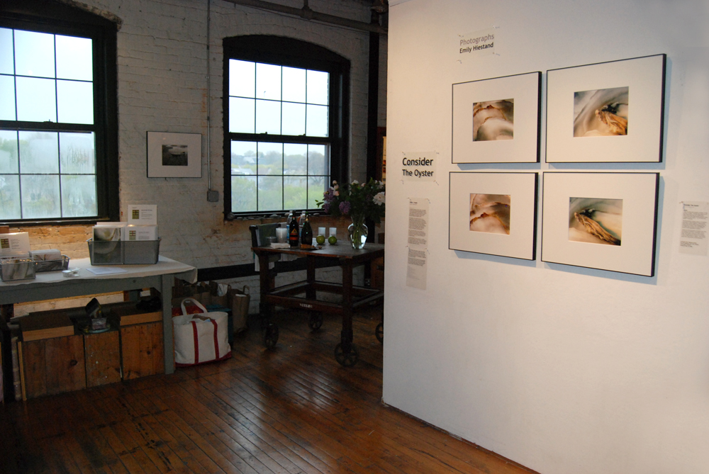
The example pictured below is from an open studio event—four close-up photos of oyster shells in a grid with substantial space around it. The images are similar in tone and mood, creating an attractive overall impression of stillness and contemplative beauty. When a viewer pauses to look, they instinctively compare the four images, seeking the differences and contrasts.
A common rule of thumb is that art should be hung at “eye level -” a somewhat arbitrary unit of measurement. In this instance, the horizontal centerline of the top row is about 62 inches off the floor. This was low enough to ensure a comfortable view for audience members of any height, but high enough that the work would be visible even when the room was full of people—an important consideration at crowded venues. If hanging work in a single row, a good starting point is to have the horizontal centerline about 54 inches off the floor, but every situation requires adjustment based on factors like foot-traffic patterns, ceiling height, and whether attendees will be sitting or standing.
Festival and open studio display spaces very often don’t have the large unbroken walls of a gallery or museum. This is another instance that can be used to your advantage by grouping images, as seen below. The six photos in the nook create a natural group, as do the two on the left-hand wall. In this case they are from the same series, but a multi-wall setup like this would be ideal for two or three distinct groups. Note the brown paper backdrop – it covered some imperfections in the wall, provided a neutral background, and also helped draw the eye of passing visitors.
It’s a great idea to sketch out your display concept in advance, making editorial decisions about which works to include and how they will be arranged. But there’s no substitute for seeing and evaluating the display in place, where you can consider lighting, visual context, traffic flow, and other factors that affect how your work will be seen. One commonly practiced technique is to arrange your works on the floor, leaning them against the wall, to assess how they can be combined and organized before installation. Using an adjustable hanging system allows for pieces to be easily rearranged and hung without putting holes in the walls. This is especially useful for temporary exhibits where repairing and repainting walls is unfeasible.
With these guidelines and your own good visual instincts, you can devise sophisticated and professional installations, even in temporary situations, and facilitate the process of building strong connections with your audience.
Guest contributor Pete Dunn is director of marketing for Gallery System Art Displays, which supplies art hanging systems to thousands of galleries and other exhibition venues. It is his good fortune to be the son and husband of visual artists, which has provided him with hands-on display experience.


