If you have spent time in museums or galleries lately, there’s a good chance that you will have seen an exhibition hung “salon-style,” a term that refers to large groupings of art that extend higher and lower than the traditional eye-level single row or “museum-style” hanging.
The salon-style display dates to an influential annual exhibition in pre-Revolutionary Paris, and offers several advantages for viewing work. Higher-hung pieces can be seen by everyone, even when the room is crowded, and the alternative perspectives on art display provide an intriguing historical throwback. In addition, more artworks can be displayed in a given space, and the non-linear approach allows exhibition designers to highlight connections or contrasts between multiple works, styles, periods, or artists.
Renwick Gallery - Grand Salon. Photo: Ron Blunt via Smithsonian Institution
For all of its benefits, it’s easy for salon-style displays to look chaotic, disconnected, or overwhelming. A sense of order and clear, logical visual lines are essential. With careful planning and execution, anyone can achieve an orderly, yet visually stimulating salon-style display.
The Grand Salon at the Smithsonian Institution’s Renwick Gallery (above) is an excellent example of successful salon-style presentation. Note how each of the three groupings has a clear focal point. On the left, a large painting anchors the center. On the end wall, a large equestrian portrait is surrounded by smaller landscapes, seascapes and urban scenes as well as indoor portraits. Together they provide a new perspective on what’s going on in the central piece, with its combination of landscape and portraiture.
Look closely at the high-resolution version of the photo, and you’ll see that the Smithsonian gallery uses a picture rail art hanging system. The works hang on cables suspended from a wall-mounted molding, with columns of two or three paintings sometimes sharing cables. This system guarantees consistent vertical alignment and also helps create a grid—both important factors in keeping the arrangement harmonious and pleasing to the viewer’s eye.
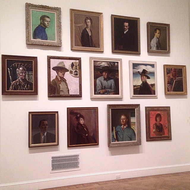
Grids, while important for consistent alignment, do not have to look rigid. One pleasure of well-executed salon-style hanging is asymmetry and variation; a less-formal display that still looks polished and intentional. The playful salon-style display of self-portraits (below) illustrates this effect.
Installation at the National Academy. Photo: Mark B. Schlemmer, via Creative Commons.
Examples of at-home salon style hanging—some more successful than others—can be found in this LA Times photo gallery. Images 4 and 5 show smaller spaces overwhelmed by too much material, while number 7 is an example of a layout that lacks a clear focal point and so does not invite the viewer in.
Whether hanging an exhibition, or simply displaying art in your own home, here are some suggestions to keep in mind:
· Think about your display as a visual narrative that reflects the similarities and contrasts between pieces both in subject matter and in medium. One work should be big or strong enough to be the focal point.
· Experiment! This video suggests using paper templates for each work to test the wall arrangements. Although the final arrangement is somewhat lacking, the idea is still a good one. Using an art hanging system would be more efficient and effective, allowing the actual works to be quickly rearranged.
· Hang pieces flat against the wall. When one or two lean out, the effect is spoiled. There is one exception: if you are fortunate enough to be in a space with very high ceilings, it is acceptable, as well as historically accurate, to angle the uppermost works slightly for better visibility—but be sure to keep the angles consistent and the display harmonious.
To see more examples of salon-style hanging both formal and informal, visit our Pinterest board.
Guest contributor Pete Dunn is director of marketing for Gallery System Art Displays, which supplies art hanging systems to thousands of galleries and other exhibition venues. It is his good fortune to be the son and husband of visual artists, which has provided him with hands-on display experience.


